
-
@mrbill cheers mate =)
Proud to introduce a friend of mine =)Robert White and his Criaturas Particulares
And other of his projects, La Santa Rodilla

-
Manly • 2014
CreditsCreated By: Jesse and M. Justin Moynihan
Written By: Jesse Moynihan and M. Justin Moynihan
Directed By: Jesse and M. Justin MoynihanStoryboard By: Jesse Moynihan
Timing Supervisor: Larry Huber
Sheet Timing: Emory Ron Myrick
Character Designers: Jesse Moynihan, Danny Hynes, Thomas Herpich, Jojo Baptista
Prop/Efx Designers: Michelle Xin, Jojo BaptistaBackground Design: Robert Sato, Jesse Moynihan
Background Painter: James Stokoe
Color Stylist: James Stokoe
Storyboard Revisions: Luke Weber
Manly Hud Design and Animation: Mike Perzigian
Fractal Planet Design and Animation: Jacky Ke JiangExecutive Producer: Fred Seibert
Producer: Kevin Kolde, Eric Homan
Co Producer: Jesse Moynihan, M. Justin Moynihan
Production Manager: Sylvia Edwards
Production Coordinators: Stephen Worth, Dana Jo Granger
Casting Director: Meredith Layne, Csa
Editor: Andy Tauke
Animatic Editor: M. Justin Moynihan
Compositing: Nicole TorresCast
Manly - Jill Bartlett
Nimbus - Joey Richter
Ahriman - Steve Agee
Skinny Ripped - Roger Craig Smith
Eyes-No-Eyes - Roger Craig Smith
"Zealots" - Joey Richter, Roger Craig Smith, Steve Agee"Voice Director: Meredith Layne
Dialogue Recording: Salami Studios Post Production
Post Production: Sound Design And Editorial
Sound Design and Editorial: Paul Menichini
Foley Mixer: Roberto Dominguez Alegria
Foley Artist: Cynthia Merrill
Dialogue Conform: Mark Mercado
Re-Recording Mixer: Thomas J. Maydeck C.A.SScore By: Jesse Moynihan, M. Justin Moynihan And Alex Tyson
Animation Checking: Wendy Jacobsmeyer
Track Reading: Slightly-Off Track Inc.
Animation Services: Dongwoo A&E Co., LtdAnimation Director: Ki-Ho Hwang
Layout Artists: Jae-Ok Lee, Sung-Kyu Kim, Hyun-Duk HongModel Checker: Mi-Young Hwang
Assistant Animation Supervisors: Jung-Sil Kang
Key Animation: Hyun-Seok Seo, Seung-Ki Cho, Suk-Ki Nam, Jong-Pil Won, Dong-Kwon Park
Final Checker: Jin Namkung
Background Director: Yoon-Ho Lee
Color Stylist: Oak-Ja Yu
Composition: Tae-Hee Heo, Dong-Pil Ku, Hye-Won LeeProduction Staff: Shinwan Kim, Young-Wun Park, Hoon-Jae Lee
-
Japan’s Studio Ghibli Envisages Short Break, not Imminent Closure
Iconic anime producer needs to slim down since retirement of Hayao Miyazaki
-
http://en.wikipedia.org/wiki/Frozen_(2013_film)
-
Salu2 monsieur @jleo =)
Today a couple of my OReally favs
Please Say Something ❖ 2009
Credits:Written, Directed & Produced by David OReilly
Sound design & Voice synthesis by David Kamp
Sound design & Music by Bram Meindersma
Distributed by Future Shorts.
The External World ❖ 2011
Credits:Directed by David OReilly
Written by David OReilly & Vernon Chatman
Produced by David OReilly & Henning Kamm
Sound & Music by Bram Meindersma
Animation by Max Stöhr, Tobias Von Burkersroda & Jim Levasseur
Rigging by Amy Hay
Voices by Julian Barratt, Pearl Brilmyer, Adam Buxton, Christopher Kline, Stefanie Jones, Bram Meindersma, Hanayo Nakajima & Tenko Nakajima -
@maxr David OReilly, great stuff! LOL:)
-
@jleo LoL de re LOL on your LOL... mogul d'mongol gol goooolllL!!!
Today's Alan Becker's kickstart founded Animator vs. Animation IV • 2014
Credits:
Music by Sarah Eide
Previous 3 episodesAnimator vs. Animation III
Animator vs. Animation II
Animator vs. Animation -
Santiago 'Bou' Grasso's Padre • 2013
Be sure to watch the BTS video, it's already soul nurturing ,-)
Credits:Productora / Production Company: opusBou
Director / Director: SANTIAGO 'BOU' GRASSO
Guión / Screenplay: SANTIAGO 'BOU' GRASSO & PATRICIO PLAZA
Fotografía / Cinematography: SERGIO PIÑEYRO
Dirección Artística / Art Director: SANTIAGO 'BOU' GRASSO
Música / Music: LUCAS NIKOTIAN & PATRICIO PLAZA
Sonido / Sound: PATRICIO PLAZA & ALEXANDRE LORMEAU
Montaje / Editing: SANTIAGO 'BOU' GRASSO
Animación / Animation: SANTIAGO 'BOU' GRASSO -
Today computer animation
Home Sweet Home • 2013
Credits:
A short movie by Pierre Clenet, Alejandro Diaz, Romain Mazevet and Stéphane Paccolat
made in Supinfocom Arles during our last year in 2013
Original music by Valentin Lafort.La Détente • 2010
Credits:
Pierre Ducos & Bertrand Bey
The film was created with technical support from KAWANIMATION
sound design by "Face B", and original music by Patrick STEMELENPixar's Inside Out trailer • to be released mid 2015
BTW I find extremely annoying that many platforms showcasing these animations do not have a clear credit sheet.
Normally these are the kind of crafted films that involve a lot of people, very hard work and LOVE;
please credit them properly, thank you =) -
Wolves • 2009
Credits:
Writer, Director: Rafael Sommerhalder
Cast: Tony Guilfoyle, Bali Engel
Sound Design, Dubbing Mix: Zhe Wu
Music: Hansueli Tischhauser
Production: Royal College of Art, London
Oru Burus • 2012
Credits:
A Supinfocom graduation movie co-directed by Anton Brand, Guillaume Klein, Charlotte Quillet and Raphaël Théolade.
///
And talking about SUPINFOCOM, check their page, there's some very nice work displayed there; recommended: Ulysse =)

Caldera • 2012
Credits:
FULL CREW
Amir Zarrin
Andrew Chan
Andrew Kantos
Andrew Nighswander
Ann Mullin
Ashley Souza
Audrey Condon
Barbara Bolles
Ben Fiske
Chris Bishop
Chris Perry
Christine Stuckart
Cristin McKee
Dan Finnegan
Dan Peck
Daniel Gilbert
Dave Boutillier
Ed Bishop
Edgardo Padilla
Evan Viera
Ian Krebs-Smith
Jake Blais
Jake Mazonson
Jarred de Beer
Jerry Chan
Jim Levasseur
Josh Marvel
Katie Taccone
Katie Wynkoop
Liz Ellis
Louai Abu-Osba
Marcus Wolf
Michael Flaherty
Nat Stein
Owen Granich-Young
Perry Chau
Raf Anzovin
Rhea Kewalramani
Rob Sandell
Ryan Moore
Sam Plattner
Samah Majadla
Shane Kirby
Stephen Sues
Taryn Johnson
Tati Soutar
William Young
-
Don't know if you guys know this one: Madame Tutli Putli
-
@MrZz gorgeous!!!... at all levels
Thank you so much for dropping L'Madame =)
Despite William Kentridge express himself through different media and his work range from drawing and painting to film, installations, text, kinetic objects and sculpture, performance and scenography; I just hastily gathered some of his older animated films available in YT.
-
Still within the arty farty world but with completely different (virtual) approach, Jonathan Monaghan
When I watched an excerpt of Alien Fanfare I have to see I literally laugh out loud, those candelabras... ja ja ja.
Monaghan works mainly with Studio Max and in his creation one can find references to cinema and the history of art and iconic objects (of pop culture). Personally I like the "absurd imperfections" and total surreal elements in his videos/renders... a flying black pineapple egg with a bouncing pair of testicles it's just perfect example.
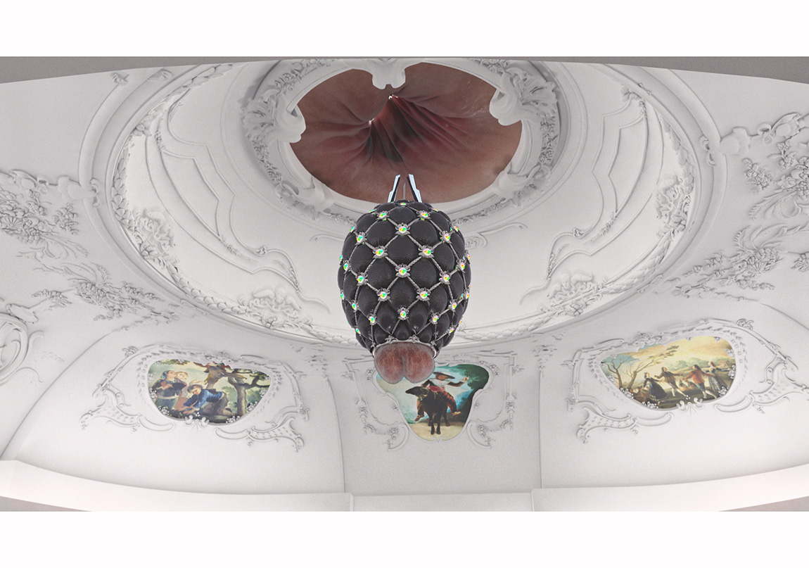
I commend you to read some of the interviews and articles, specially the 2014 ones - here.
Note that almost all videos here are excerpts and not the full shebang
And some grabs from his renders
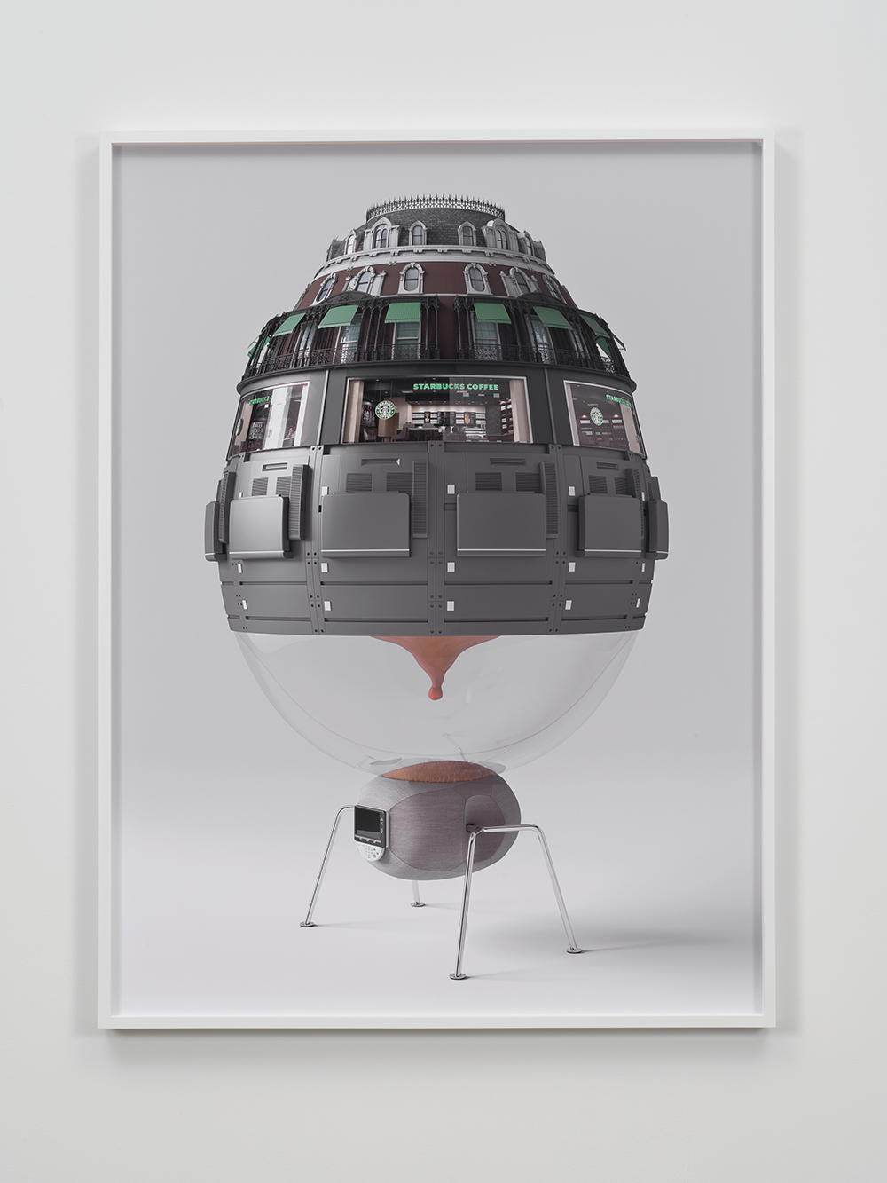
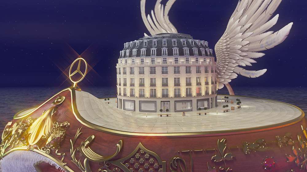
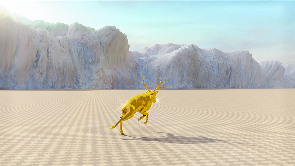
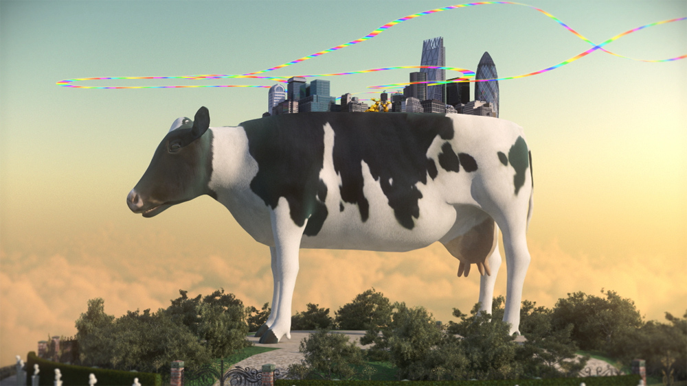

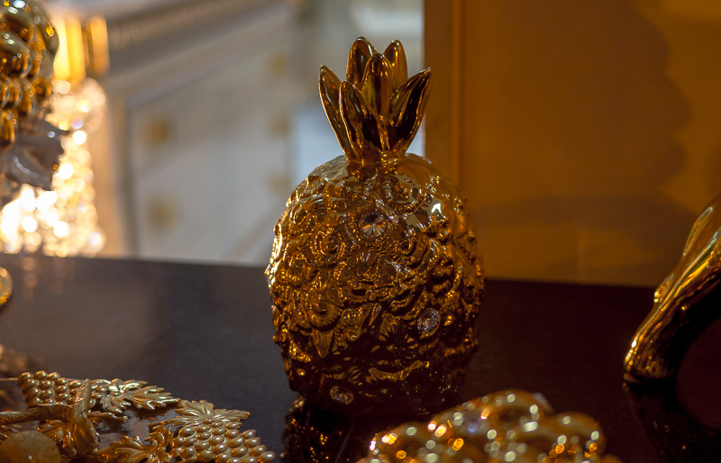
Coincidently enough, this afternoon I was passing a "fine" neighbourhood and in a decor shop's window, other than the mandatory buddha, there were these very expensive... things, which seemed 3d renditions of a Jonathan Monaghan's videos imaginary.


An this snail shop can be part of it too, those are empty snails shells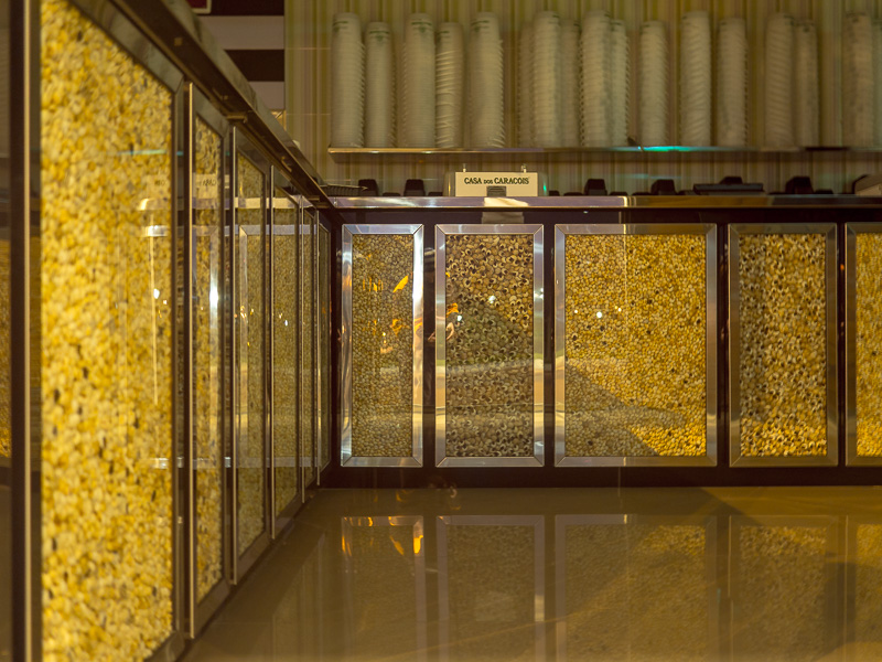

 IRL_.jpg800 x 1056 - 265K
 IRL_2.jpg800 x 514 - 146K
 IRL_3.jpg800 x 470 - 144K
 snails-shop-1.jpg800 x 600 - 202K
 -
Some of the 72 beness galore from Mr. Lee Hardcastle
-
The Dam Keeper • 2014
Credits:
Robert Kondo (Director)
Daisuke 'Dice' Tsutsumi (Director)
Zach Johnston and Matteo Roberts (Composers)
Erick Oh (Supervising Animator)
Bradley Furnish (Editor)
Duncan Ramsay (Producer)
Megan Bartel (Producer) -
@BurnetRhoades hey man, so good to "see" ya Sean =)
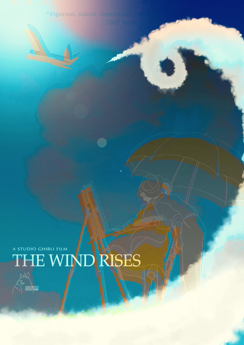
Did know this one, but many probably don't, anyway important thing 4 me to say is thank you for hiving it hereJust came from the cinema, watching for the 3rd time Kaze tachinu (The Wind Rises), probably Miyazaki's last.
Such profound beauty and sensitivity portraying the "good and bad things" without ever falling into cliches, such love 4 the characters, for the work and curiosity for life... I always laugh, cry and keep being surprised with the craftsmanship, dedication and passion, ufff. And the soundtrack and those sound effects made (almost all) with mouth and voices, so full, so colourfull... piercing the heart of life
-
Did know this one, but many probably don't, anyway important thing 4 me to say is thank you for hiving it here
Yeah, it's a few years old but it got passed around at work as we were all looking at interesting "hybrid" styles and I hadn't seen it before. I don't have a lot of patience for toon shaded stuff but the way comic art was used as textures was really well done, I thought. I loved how they did the clouds in this piece as well. Very graphic but still some realism to the feel of the light and really dramatic compositions.
I still need to see Miyazaki's latest. I haven't cared for how tight and wobbly (I know that sounds contradictory) the Ghibli style has gotten in recent years but the film itself I'm sure is as good as everyone says.
edit: oh, and thanks. Yeah I had gotten out of the habit of P-V but felt compelled to come back recently to see what folks were talking about.
-
@BurnetRhoades what do you mean with "wobbly"?
-
The drawings aren't solid any more. They have a "wobbly" quality not too dissimilar from the effect you get having clean up drawings traced by someone onto an acetate cel instead of transferring the clean up drawing directly. You get features that go off model, forms that might have been very solid in the clean up drawing kind of skewed, etc. Wandering lines. I'm also not really a fan of how flat everything is anymore in their films.
Because these films are all done with digital tools now I know nobody is tracing them so I'm at a loss for the why and how this has crept into all of their work. I would have to see some kind of behind the scenes look into the studio so that I could watch the process.
If they're not actually drawing on paper at all, that would be one of my suspicions. But basically, even though Miyazaki's character designs have remained very common from film to film, for decades, the drawings themselves have become less appealing and the draftsmanship that was there in the '70s and '80s has been lost somehow. What I see now are stiff, impressions of his style.
It's a very subtle thing, perhaps, but I see the change happen between Princess Mononoke and Spirited Away, the later of the two being undeniably digital and flatter, in palette and in overall character design. I don't feel the same forms anymore or sense that they were drawn by pencil.
edit: a case in point is evident in that poster above. The male character's left upper arm is just made of squiggles that don't relate to a real form connected to the form of his torso. We recognize what they are but the rumples represented by the squiggly lines don't relate truthfully to the form of the arm underneath causing them to fold in a particular way. So they don't relate to anatomy and they don't create a two dimensionally pleasing form either. That's how most of their drawings look to me anymore so it's very difficult for me to enjoy watching their more recent films, which I'm sure are fantastic as films. The art just pushes a bunch of buttons for me that I'm hyper sensitive to. I can't watch contemporary Mamoru Oshii films for similar reasons and it makes me sad.
-
I'm glad that I asked, thank you for the really great insights Sean =)
Your film—let people feel the soul and the heart there, but let it be made like a work of hands {R. Bresson}
One of the things I myself like more about feeling a hand (drawing, molding, scratching, erasing, etc.) behind the imaging is the (freeness of the) error, the imperfections and the very subtle and fresh variations... but technology it's such a bitch or better, we are her bitches :PIndeed it's a subtle thing - many subtle things actually - and I don't remotely have the knowledge or experience to "understand" such changes... but I should be able to feel them {monkey hugging a rock}
I don't think there's any Miyazaki film I have watched so many times as this last one, also in such a variety of different situations/contexts from being with someone I was falling in love (end up in murder), to being alone or with my close primate family; from large screen to computer screen to huge cinema screen with proper surround sound.Miyazaki has always had a crush for plains (flying beings/things) as I was about to discover in Porco Rosso (Kurenai no buta) first film from Miyazaki that I really watched and still today one of my favorites. Actually for me there's a phase that ends there Nausika, Castle, Totoro, Kiki's and Porco. From Mononoke on there's another way (maybe more epic or sophisticated) of "letting" the story and characters unfold; not talking so much technically but matter's of direction.
I would be lying if I said I didn't enjoy Miyazaki's following long features. But in this "final" The Wind Rises there is a uncommon communion of very peaceful, a bit sad (as all goodbyes are), fresh and subtly nuanced well balanced elements. When I was watching it for the third time I couldn't stop thinking about Kurosawa's Stray Dogs, maybe 'cause it has the same historicaly wounded perspective... also the digital artwork processing looked quite matured and well implemented. Another aspect of watching something so many times is that one is confronted with the fact of knowing the story, so either gets boring or the artwork matter offers something else. Each time I was kept under the spell of experiencing new wonders and nuances and layers... and this is something rather difficult to do. It also fascinated me how so many scenes were so close from becoming a cliche and still each time was there a fascinating "resolution", new approach within our threshed way of representing the world... curiosity!!!
To wrap-up this messy writing and hoping I can be forgiven for quoting again my fav R. Bresson's,
In this language of images, one must lose completely the notion of image. The images must exclude the idea of image. (Sounds like a Zen koan, but it is a simple declaration of the primacy of emotive engagement.)I wander if Miyazaki was referring to (himself and) animation as a dream when
he chose Paul Valéry's The Graveyard By The Sea last verse: -
@maxr, are you daltonic? it seems your suggestions are all biased towards magenta. Maybe green gel your opticals.
-
@maxr Interesting. Well, I do think I will watch it one of these days. I do think he's one of the most unique and gifted storytellers in animation. Nausicaa will likely always be my favorite but I do feel a certain loss not having seen all of his films yet.
Animation is my first love so all of my reactions are very emotional. That I learned how it's made has had both positive and negative effects on my perception of what I see. Whereas I'm an advocate of digital techniques for most areas of visual effects I'm far more conservative when it comes to animation. I know that digital techniques can open new creative possibilities while also being cheaper than traditional methods but I can't stand how absolute so much of the process has become. I'm just glad I got to see the final days of real cel animation.
-
@eyefi jajajajajaj vey daltonic indeed, nevertheless I still feel lucky ,-) In honor to you I did fix my right eye; with a spun
@BurnetRhoades ... I did ponder about what you said; because you said "first love" and that got me thinking, traveling... fzzziuuhhh outer space. Who knows... when I was a child I did make very intricate and complex drawings with spaceships and robots and laser beans {I meant "beams" which are different weapons} and mother ships with the most incredible (literally) forms and those drawings were only sketches to draw even more precise parts of a narrative I now imagine I had lingering in my head, 6 or 7 years old... bad quality sugar.
So what I did - against my own limit of 1 max 2 video per post - I've taken a idle little dive into some anime sequences. I reckon these are not so much the "style you're into", which seems a bit more dreamy and stylized (egg); in total fairness these are not my "style" either but for several reasons (from color, to the drawing, to the background, to the movements) they made ricochete =)
Legend of the Galactic Heroes, space opera (just the awesomeness of the costumes!!) beautiful beautiful drawing - with bolero and all
Ideon, remix AMV - for those who don't know anime music video made by fans
Macross, sense of rhythm and space
Macross 2, another different story, however this duel is too epic to pass
just the end - from 2'56'' to 3:01'' five great seconds (Macross plus)
-
I love this intro, great colour's palette, Gundam 1982
Baoh, a little bit of gorey plasmodic
The cool, the funk, the smokey Cowboy Bebop... or BIUTIFUL handsaws, sometimes damaged by CGI
For those who want it ALL
And for finishing with something completelly different:Hokuto no Ken (or if HeMan had a dealer)
and Luffy!!! I mean One Piece
Howdy, Stranger!
It looks like you're new here. If you want to get involved, click one of these buttons!
Categories
- Topics List23,964
- Blog5,723
- General and News1,342
- Hacks and Patches1,151
- ↳ Top Settings33
- ↳ Beginners254
- ↳ Archives402
- ↳ Hacks News and Development56
- Cameras2,361
- ↳ Panasonic990
- ↳ Canon118
- ↳ Sony154
- ↳ Nikon96
- ↳ Pentax and Samsung70
- ↳ Olympus and Fujifilm99
- ↳ Compacts and Camcorders299
- ↳ Smartphones for video97
- ↳ Pro Video Cameras191
- ↳ BlackMagic and other raw cameras121
- Skill1,961
- ↳ Business and distribution66
- ↳ Preparation, scripts and legal38
- ↳ Art149
- ↳ Import, Convert, Exporting291
- ↳ Editors191
- ↳ Effects and stunts115
- ↳ Color grading197
- ↳ Sound and Music280
- ↳ Lighting96
- ↳ Software and storage tips267
- Gear5,414
- ↳ Filters, Adapters, Matte boxes344
- ↳ Lenses1,579
- ↳ Follow focus and gears93
- ↳ Sound498
- ↳ Lighting gear314
- ↳ Camera movement230
- ↳ Gimbals and copters302
- ↳ Rigs and related stuff272
- ↳ Power solutions83
- ↳ Monitors and viewfinders339
- ↳ Tripods and fluid heads139
- ↳ Storage286
- ↳ Computers and studio gear560
- ↳ VR and 3D248
- Showcase1,859
- Marketplace2,834
- Offtopic1,319
Tags in Topic
- animation 11
- cinematic 10
- animation, 1
- puppetry 1


