-
@GravitateMediaGroup your Dirty Harry nice poster doesn't show, seems can't be directly embed
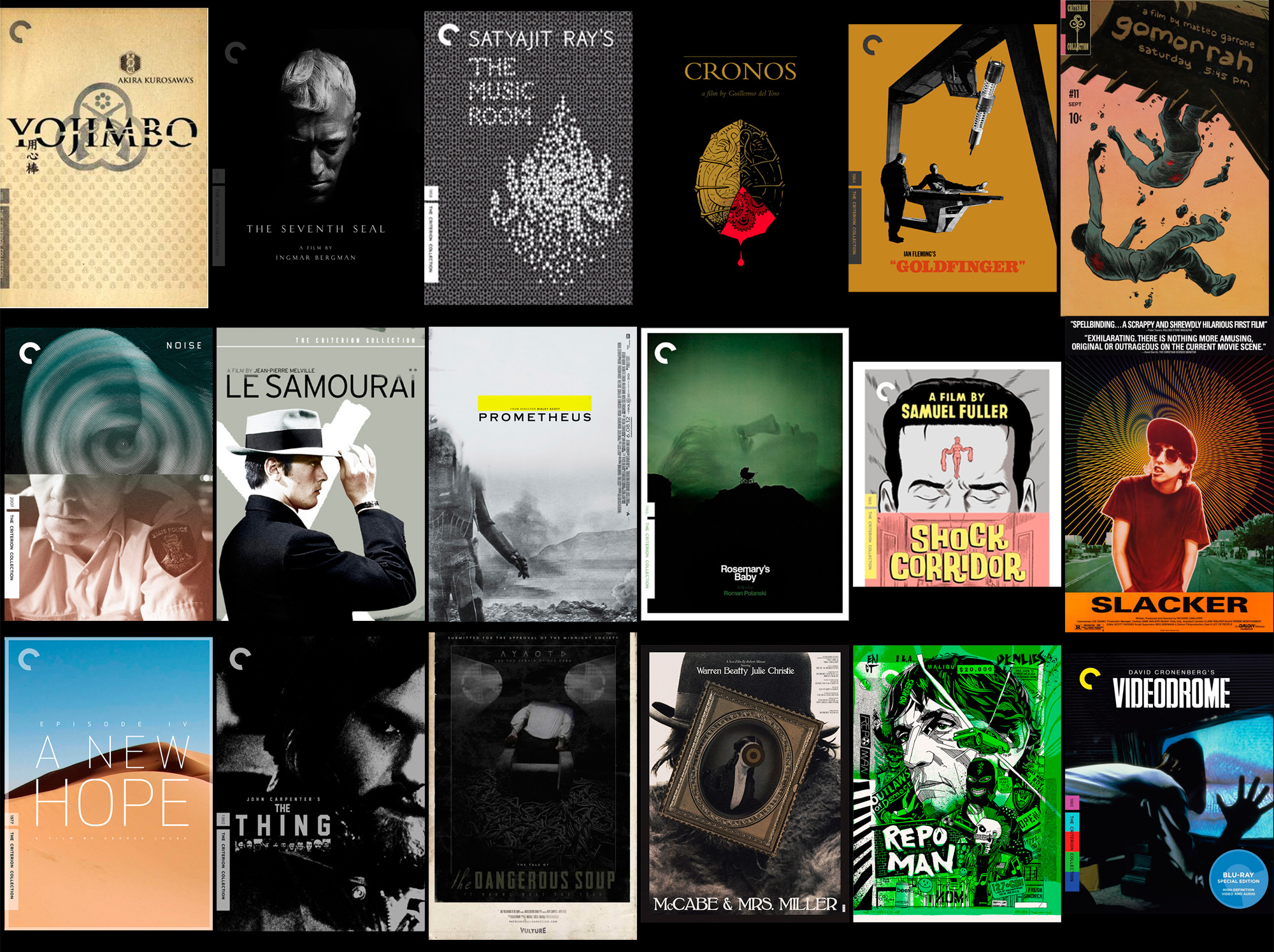
Some of these guys amazing work; not sure about the Cronos one though
-

Here are a couple of theater posters I made at a former job. For Swing and The Sound of Music we were provided a logo. The "posters" were only made for the small form factor of being one of the featured images on the college website and weren't used in any other size.
-
@jpbturbo that's the way, loving your children no matter what (size). To lo guano Josh =)
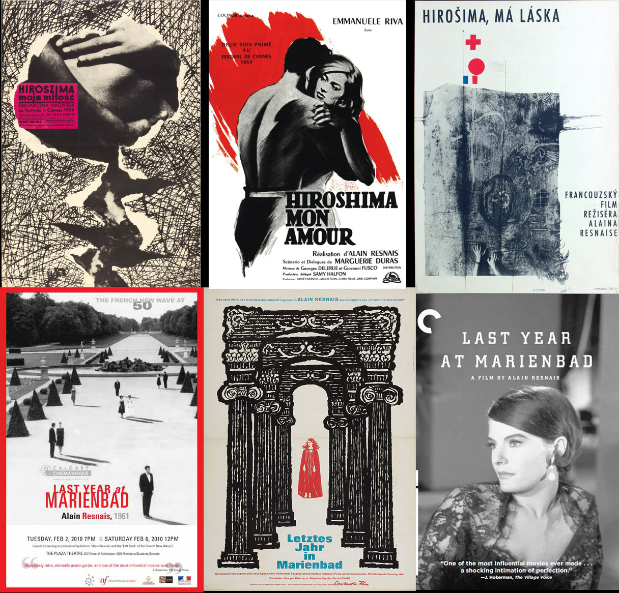
Alain Resnais' Hiroshima mon amour, 1959 / L'Année dernière à Marienbad, 1961
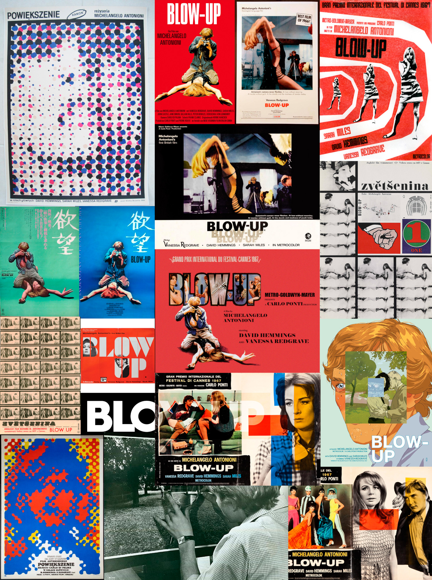
2 originals and Criterion, Polish, Bedřich Dlouhý and German versions.
Rusian, Polish and Czech... and some Bulgarian movie poster designers are just way way aheadBoth on the left my favs, Polska dude is simply too good an original is really really nice, with the high vanishing point, the way space is inhabit and how those forms give shape and relate... and only human projecting shadows!! That's what I call reusing well an still :P
 AL.jpg1216 x 1166 - 474K
 -
I like that one all right. Alex Pardee's version is too literal and gory ,-)
In horror movies' posters there's sooo much nice work... is like they make it up for the low budget
3 other versions worth knowing
Actually there are also interesting "childish" version of horror movies, Philiphino, Indian, etc.
-
I like Option C the most of those but the original has always been one of my favorite horror posters. Back when they used to do sweet paintings for posters and VHS covers.
-
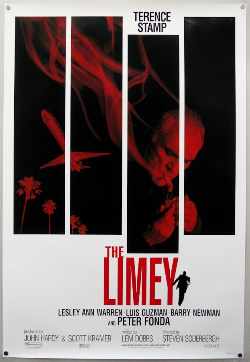
That Limey poster is killer!
-
Back when this came out I was working at Centropolis FX which shared the same building as Artisan Entertainment, in the MTV building in Santa Monica, CA. They had a huge poster of The Limey for the longest time in their lobby. Artisan was the real deal, for independents, before getting bought by Lions Gate. LG still puts out indies but if you look at the filmography before the buyout you see a major difference in content. This was one of my favorites, and one of my favorite Soderberg movies.
-
Don't know the Limey film, in check list, but surely is interesting you providing such first hand context. Thanks melting creature :P
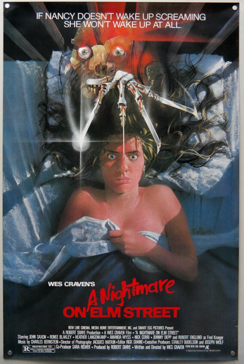
I must confess I'm a bit remorseful of my previous entry, the A Nightmare on Elm Street original poster is just too 80's and good =) // actually I'm changing it for the one you liked, then I can feel less bad (these tight editing deadlines mr Kiselev has forward, I like them, rushhh) // I shut up, now
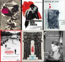
Here's one from a film I really liked, dark
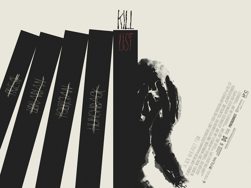
Kill List, 2011 - poster by Iron Jaiden, the original is also superb, but this had more dialog with Limey one ,-)
 jaiden-kill-list.jpg800 x 600 - 85K
 -
Don't know the Limey film, in check list, but surely is interesting you providing such first hand context...
Definitely check it out. It's a fantastic little film. When I think of Tarrence Stamp he's either this character or General Zod from Superman II. This was back when Soderberg was doing "one for them, one for me" and this was one of the films for him.
That Kill List poster is awesome.
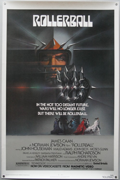

 Rollerball_onesheet_video-1-500x748.jpg500 x 748 - 84K
 -
ja ja ja we're going back then to the future. Man I wish I've lived in the seventies!!
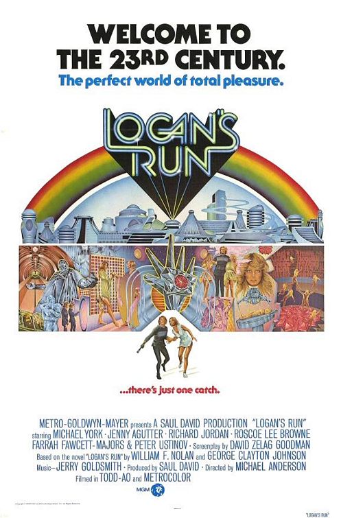
Logan's Run, 1976 - haven't read the book, but I saw this, I saw this when I was very small... ohhh
Below is a version I also like, most probably inspired by Fassbinder's The world on a wire poster.
I go with my own search/randomness, but recently I found a really fantastic work ('cause they match my selection, ja ja ja, sorry, my inner clown...) on collecting posters, among other things, if you don't already know, check this guys poster of the week, though poster of the weak should be funnier
 logans_run.jpg497 x 755 - 75K
 LoganRun_02.jpg800 x 1200 - 419K
 -
Oh yeah, there's just no substitute for 1970s and (some of) 1980s futurism. The graphic design and maybe even more specifically the typefaces. The homogeny that crept into poster design by even the early 1990s is deplorable.
By this time what people were going to see at the theater was likely defined before ever leaving the house so why should distributors care if the poster is really good anymore. Film marketing became less about word-of-mouth or a catchy poster/box and more about over-saturation in other media.
Here's one for a surprisingly dark, disturbing film:
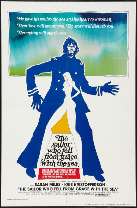
...I like it because it's weird, I guess, hah-hah.

 lf.jpg450 x 680 - 76K
 -
That one is so nicely beatles :P - Don't know that movie either.
Isn't it funny, spend 250 mill bucks on a production and then the visual wrappers are so... empty?
I guess that the job is just in the "wrong" hands... cause there's plenty of talent out thereThis dude Laurent Durieux makes truly AWESOME stuff, just check his rendition of Hitchcock, other classics, or this one
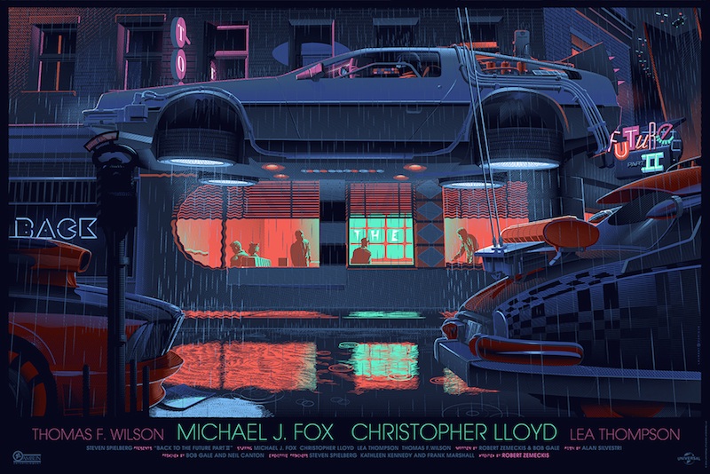

 Laurent Durieux-Back-to-the-Future-Part-2.jpg800 x 534 - 176K
 -
I shot a doc about Joe Caroff last year and that guy made some of the best...

 MV5BMTM0NDAxOTI5MF5BMl5BanBnXkFtZTcwNjI4Mjg3NA@@._V1_SX214_AL_.jpg214 x 321 - 19K
 MV5BMjI4MDIyNjcxMl5BMl5BanBnXkFtZTcwNjA4OTYwNA@@._V1_SX214_AL_.jpg214 x 321 - 21K
 The_Last_Temptation_of_Christ_poster.png300 x 459 - 57K
 -
@rockroadpix I'd love to see that doc =). The WSS is a classic
Though not in the same genre, it reminded me of the twenty years later AWIL,
this poster version is not the original, but an Olly Moss, who's doing terrific work too ,-)
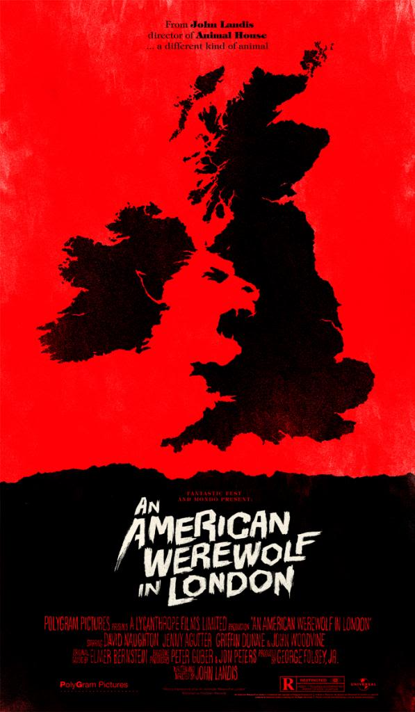
 ollymoss.jpg1270 x 849 - 96K
 -
@maxr - http://nitrous.tv/client/caroff-trailer This is the quick edit they did for trying to get the pilot going. Still can't believe they didn't grade it. :(
-
@rockroadpix wow, I'd love to hear more of Caroff's stories, he looks like such an interesting character!! Big thanks for sharing =)
So, one of Caroff's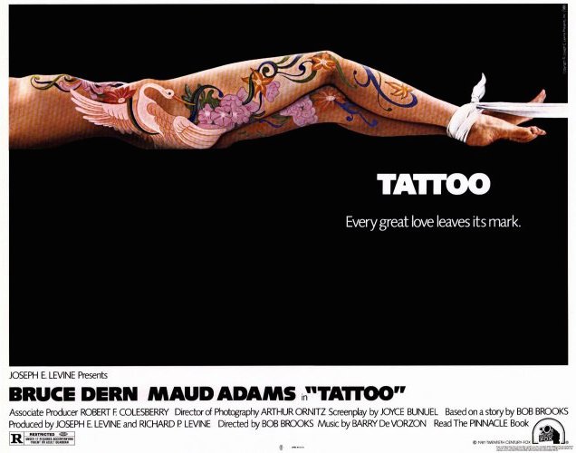
-
@maxr - When they finish it, if ever, I'll post a link. He's an incredible little dude. He does 30 push ups every day at the age of 93! Still sharp as a tack.
-
@rockroadpix I love bad-ass grandpas, it is "easy" to be cool at 21 but if you're 93 and you still kicking ass... that's another level of coolness ,-) I'm counting on your link
Another of my favourite posters, dunno know who made the japanese version but gashô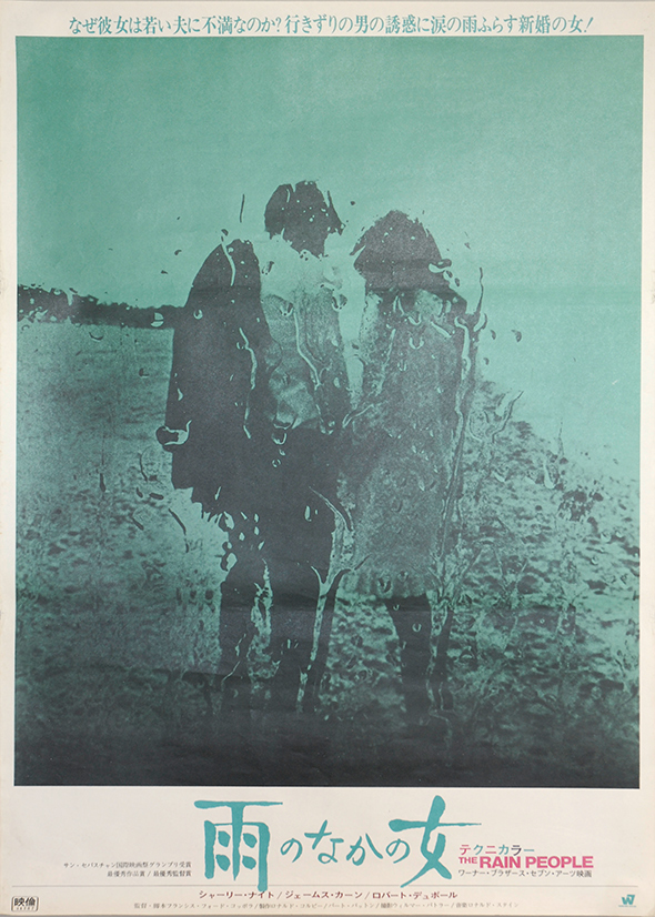
Francis Ford Coppola's The Rain People - 1969
and purple west version with different still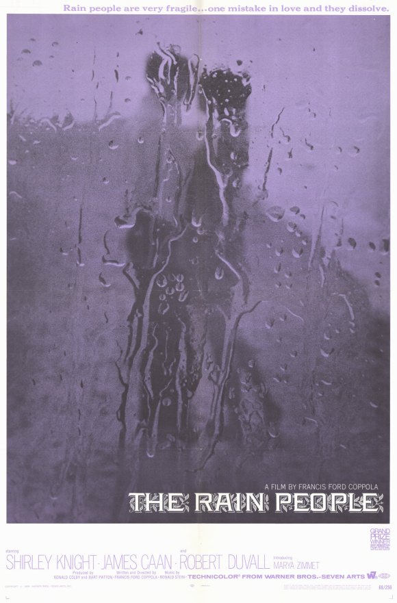
-
@maxr Amazing posters for The Rain People.
-
Thanks to all who've contributed here. I love this thread.
-
Hey, it's October 1st!
I find this one very effective.

 halloween-movie-poster.jpg580 x 887 - 72K
 -
@matt_gh2 thanks for having good taste :P
Thanks to all who've contributed here. I love this thread.@racer5 and the thread loves you :D
I find this one very effective.@rockroadpix indeeeeeeeeed
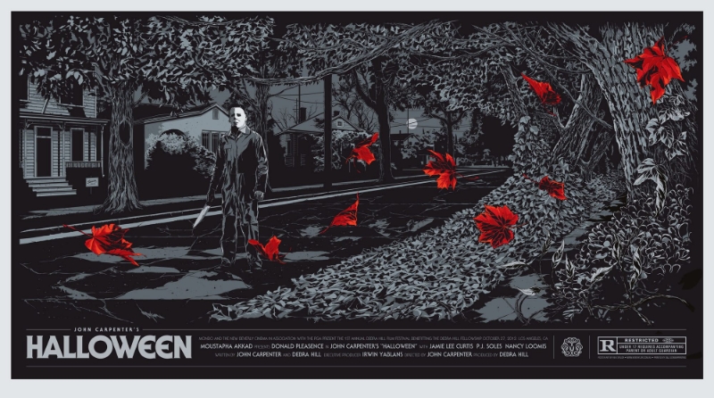
Another version, more stylised (doesn't mean better ,-)
Because of 1st of Oct, a gif from ASMODEXIA, such a compendium on framing as sadly on bad acting


 Dthing.jpg585 x 901 - 182K
 post_teneb.jpg489 x 720 - 33K
 rosebabe.jpg585 x 893 - 84K
 RB.jpg486 x 700 - 23K
 Youre-Next-poster-best-movie-posters-2013.jpg570 x 845 - 93K
 hous.jpg497 x 750 - 62K
 st.jpg580 x 871 - 159K
 hallo_other_vers.jpg800 x 446 - 264K
Howdy, Stranger!
It looks like you're new here. If you want to get involved, click one of these buttons!
Categories
- Topics List23,964
- Blog5,723
- General and News1,342
- Hacks and Patches1,151
- ↳ Top Settings33
- ↳ Beginners254
- ↳ Archives402
- ↳ Hacks News and Development56
- Cameras2,361
- ↳ Panasonic990
- ↳ Canon118
- ↳ Sony154
- ↳ Nikon96
- ↳ Pentax and Samsung70
- ↳ Olympus and Fujifilm99
- ↳ Compacts and Camcorders299
- ↳ Smartphones for video97
- ↳ Pro Video Cameras191
- ↳ BlackMagic and other raw cameras121
- Skill1,961
- ↳ Business and distribution66
- ↳ Preparation, scripts and legal38
- ↳ Art149
- ↳ Import, Convert, Exporting291
- ↳ Editors191
- ↳ Effects and stunts115
- ↳ Color grading197
- ↳ Sound and Music280
- ↳ Lighting96
- ↳ Software and storage tips267
- Gear5,414
- ↳ Filters, Adapters, Matte boxes344
- ↳ Lenses1,579
- ↳ Follow focus and gears93
- ↳ Sound498
- ↳ Lighting gear314
- ↳ Camera movement230
- ↳ Gimbals and copters302
- ↳ Rigs and related stuff272
- ↳ Power solutions83
- ↳ Monitors and viewfinders339
- ↳ Tripods and fluid heads139
- ↳ Storage286
- ↳ Computers and studio gear560
- ↳ VR and 3D248
- Showcase1,859
- Marketplace2,834
- Offtopic1,319
Tags in Topic
- selection 5
- poster 1
- participative 1


