It allows to keep PV going, with more focus towards AI, but keeping be one of the few truly independent places.
-
My first reaction to the shot was that I like it. But I think @shian is right with the camera side keying and stark contrast of door to rest of shot. However, the way you have it lit/setup, it would seem to be appropriate if the story is at a point where that character is discovering/understanding something for the first time. In that case, the prominence of the key on the character kinda makes us feel that process of discovery. (Of course that too would be contingent on how the shots/scenes preceding it looked. If by chance I guessed right and that's how the story is going here, then I would say that it would be nice if the preceding shot was darker and then we see this character lit as you have him lit here.) Keep rockin!
-
@matt_gh2 - Exactly what's going on actually. I hoped at least the lighting would have some motivation. Unfortunately, the opposite characters reverse is a bit weaker. Live and learn!
-
@artiswar If the character who's playing opposite of the guy shown, had a weak performance or shot doesn't look good visually, maybe edit around it. What I'm thinking about is this: maybe stay on the character shown in still here, and perhaps just let the audio from the opposing character play (assuming this main character's reactions were appropriate). If it's a dialogue between the two of them, perhaps it could be powerful if that opposing character's voice is heard, and we see reaction from the character shown in the still here. Maybe doing it that way could work, with one or two brief cuts to the opposing character just for a moment or two...to kinda connect it all. (In this scenario, you could even go back and get more audio dialogue/takes if actor is still available but locations aren't for reshoot.) Trust your instincts, you'll find a way. Reconnect to the essence of the story and let the power of that come through as you edit. From the small stills you've shared, I have a feeling you're doing some good work here. Would love to see the film once you've completed. Good luck.
-
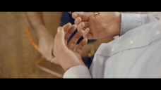
@matt_gh2 - Great minds think alike! That's exactly how I edited around it, as much as I could. On the contrary, here's a comparative grab I really like. Light set up was
Key - 800w Daylight DIY outside along with sunlight Fill - 400w Bounced off the ceiling

 Screen Shot 2012-10-22 at 4.06.37 PM.png2560 x 1440 - 3M
 Screen Shot 2012-10-22 at 4.06.10 PM.png2560 x 1440 - 4M
 -
Actually, that last frame grab, it looks like the hands are the focus of the shot.. I would have used an increased contrast to draw your attention to the hands. My eye keeps moving between the hands and the floor to see what's going on down there. If something were going on with the dude near the floor, I would have used another shot just for that. You don't necessarily want too many things happening at once in the shot, that's what other shots/scenes are for.
Howdy, Stranger!
It looks like you're new here. If you want to get involved, click one of these buttons!
Categories
- Topics List23,970
- Blog5,724
- General and News1,346
- Hacks and Patches1,153
- ↳ Top Settings33
- ↳ Beginners255
- ↳ Archives402
- ↳ Hacks News and Development56
- Cameras2,360
- ↳ Panasonic990
- ↳ Canon118
- ↳ Sony155
- ↳ Nikon96
- ↳ Pentax and Samsung70
- ↳ Olympus and Fujifilm100
- ↳ Compacts and Camcorders300
- ↳ Smartphones for video97
- ↳ Pro Video Cameras191
- ↳ BlackMagic and other raw cameras117
- Skill1,961
- ↳ Business and distribution66
- ↳ Preparation, scripts and legal38
- ↳ Art149
- ↳ Import, Convert, Exporting291
- ↳ Editors191
- ↳ Effects and stunts115
- ↳ Color grading197
- ↳ Sound and Music280
- ↳ Lighting96
- ↳ Software and storage tips267
- Gear5,414
- ↳ Filters, Adapters, Matte boxes344
- ↳ Lenses1,579
- ↳ Follow focus and gears93
- ↳ Sound498
- ↳ Lighting gear314
- ↳ Camera movement230
- ↳ Gimbals and copters302
- ↳ Rigs and related stuff272
- ↳ Power solutions83
- ↳ Monitors and viewfinders339
- ↳ Tripods and fluid heads139
- ↳ Storage286
- ↳ Computers and studio gear560
- ↳ VR and 3D248
- Showcase1,859
- Marketplace2,834
- Offtopic1,319


